
Mave Studio
Mave Studio
Mave Studio is an interior design practice that creates spaces people actually want to live and work in. They came to me needing a brand identity and website that reflected the quality of their work without getting in the way of it. A fairly classic brief, but one I really enjoyed.
Mave Studio is an interior design practice that creates spaces people actually want to live and work in. They came to me needing a brand identity and website that reflected the quality of their work without getting in the way of it. A fairly classic brief, but one I really enjoyed.


Client
Mave Studio
Deliverables
Website Branding Copwriting UI/UX Design
Year
2024
Role
Web Designer, Branding
Client
Mave Studio
Deliverables
Website Branding Copwriting UI/UX Design
Year
2024
Role
Web Designer, Branding
The Site
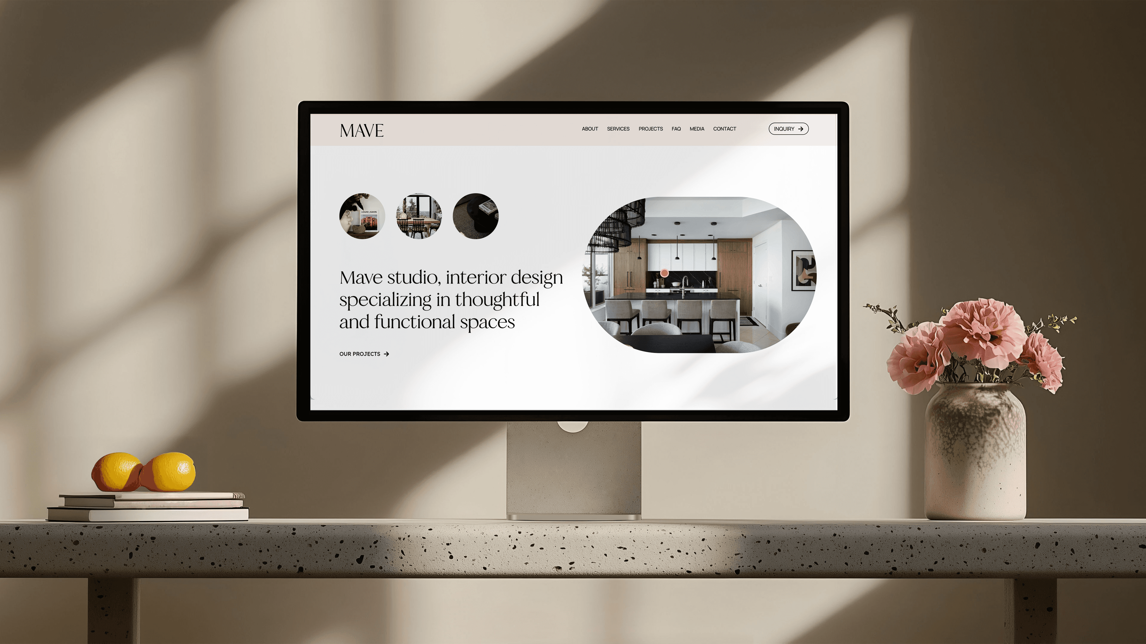
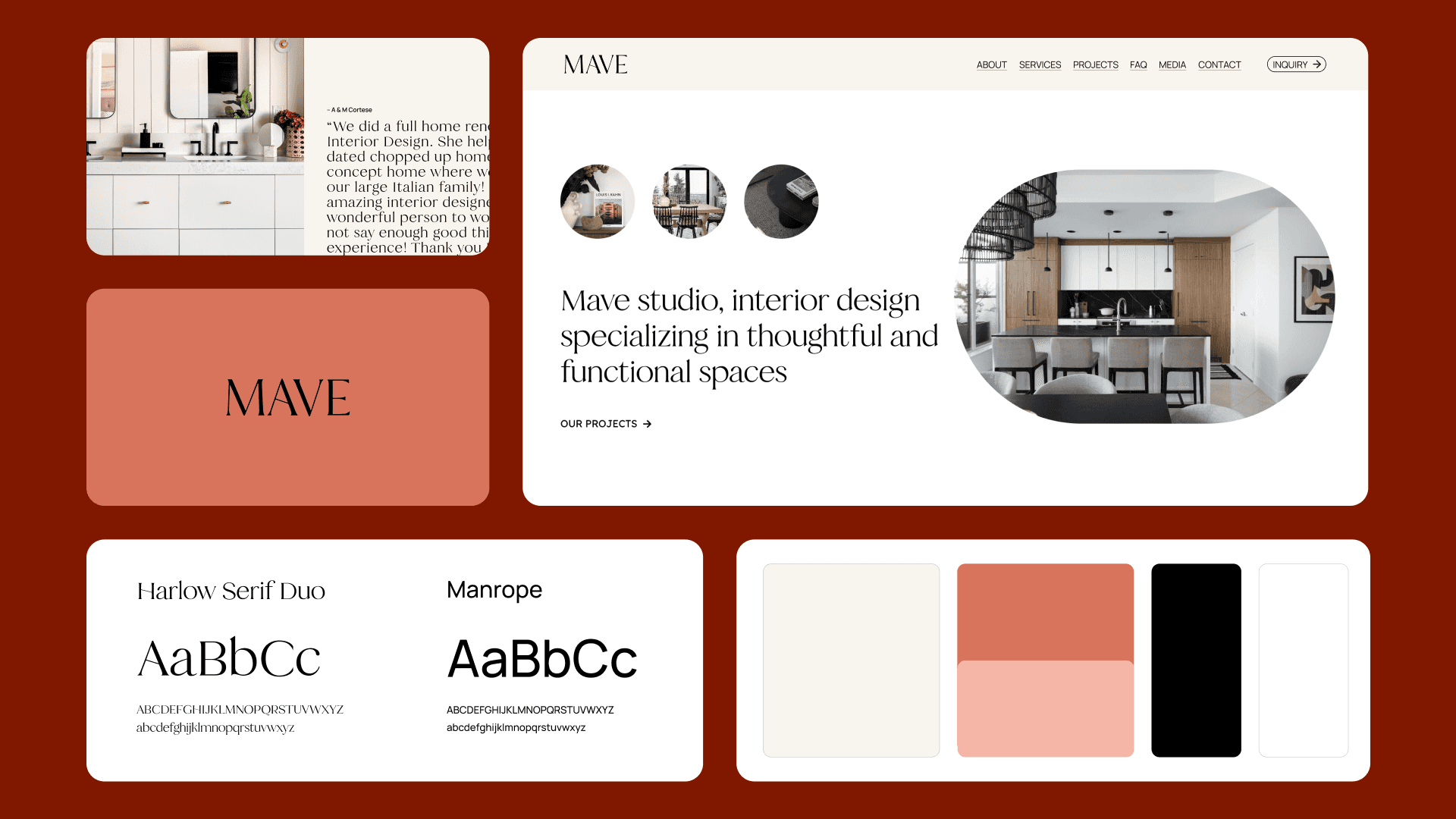
The site uses neutral tones, considered typography, and generous white space. It mirrors the studio's design approach directly: nothing is there unless it needs to be.
The site uses neutral tones, considered typography, and generous white space. It mirrors the studio's design approach directly: nothing is there unless it needs to be.
Projects
The Site
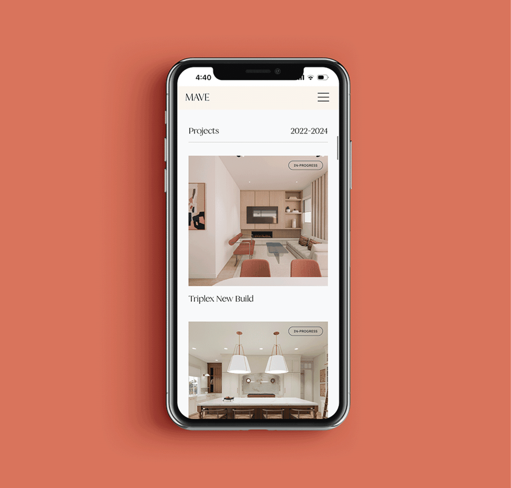
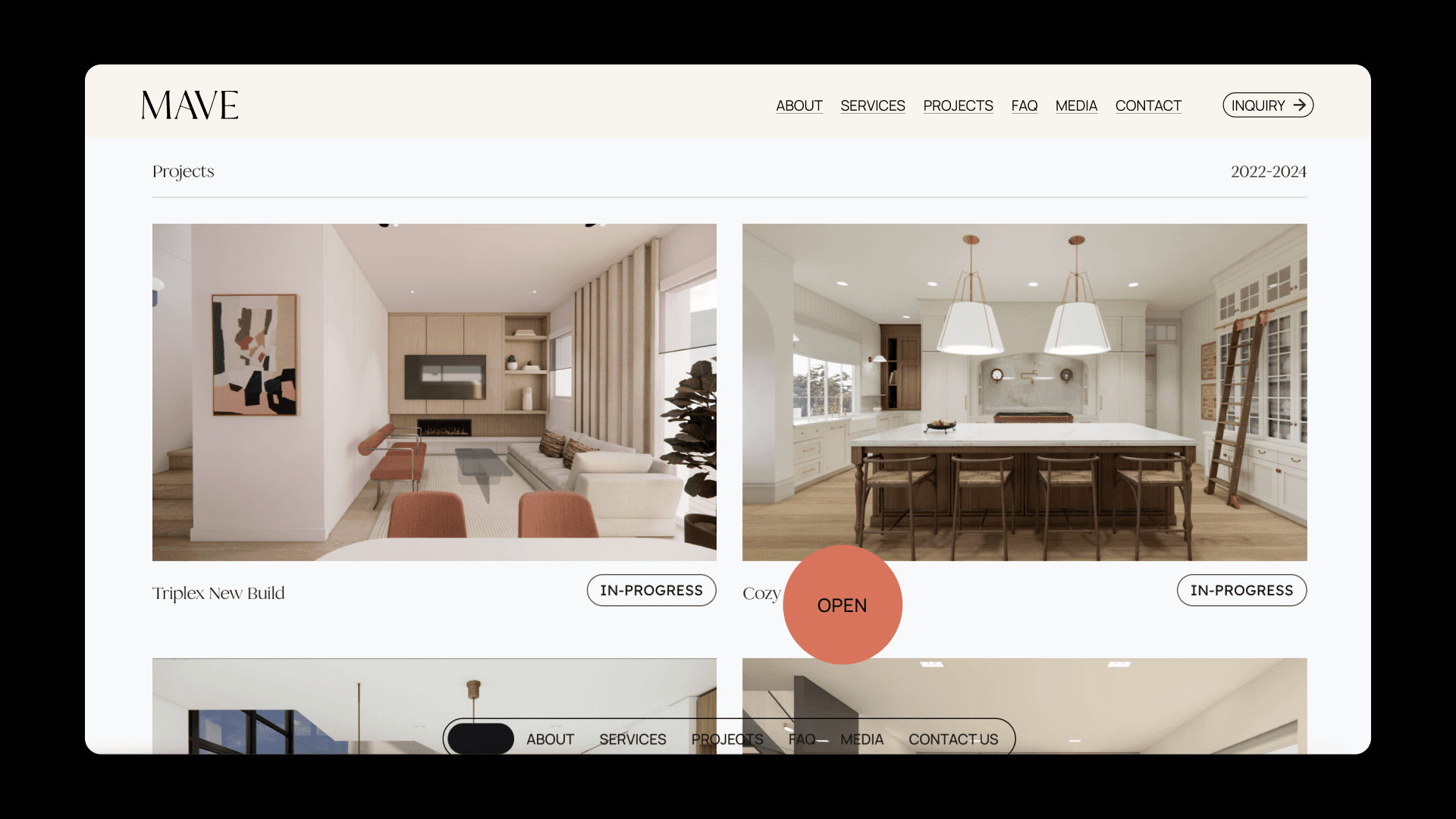
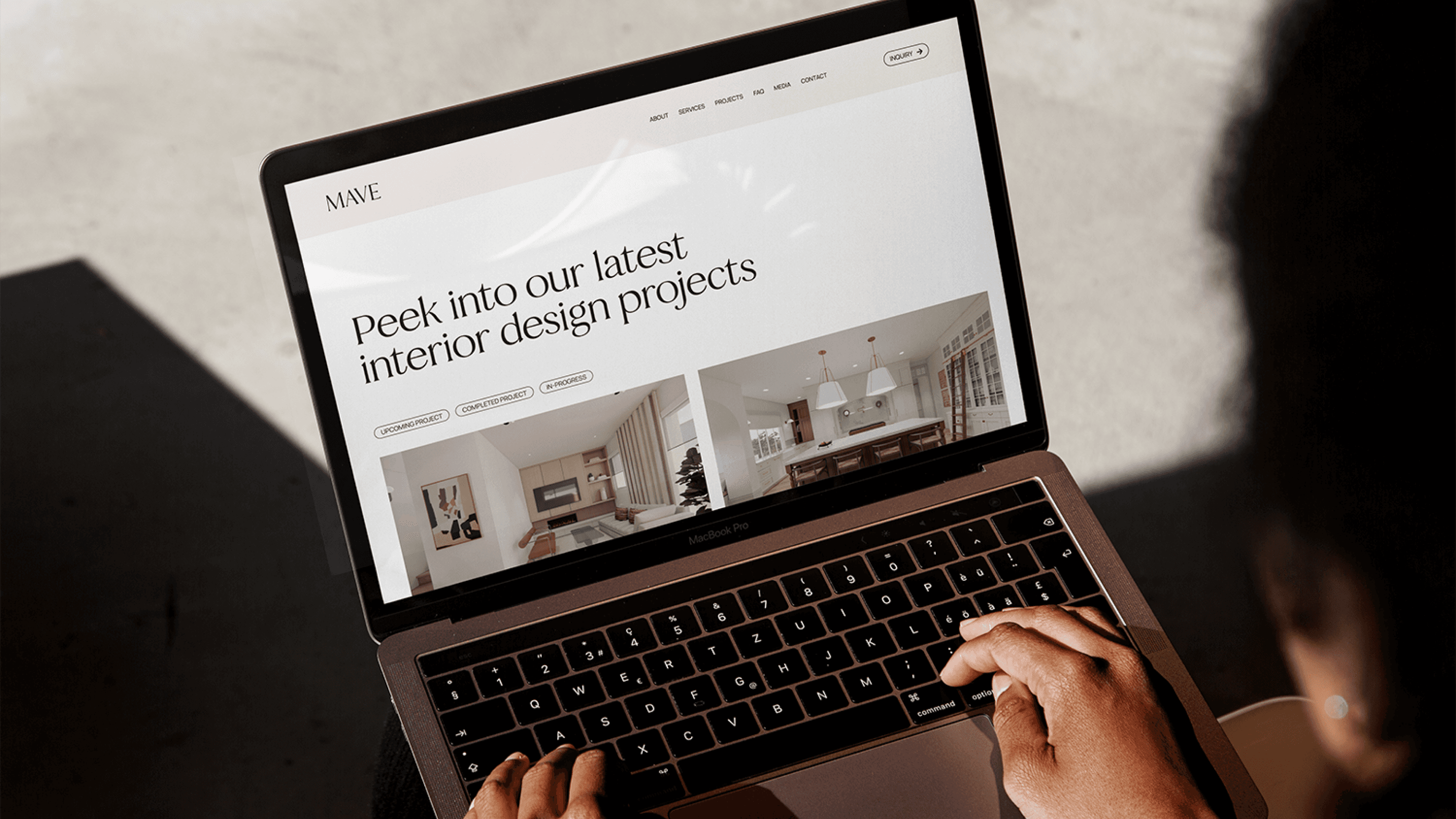
The projects section needed to do a lot. Show work at every stage, from early concept to finished space, and integrate 3D renders for projects still being built. I designed it to feel like a portfolio within a portfolio: visual, detailed, and easy to move through without feeling overwhelming.
The site uses neutral tones, considered typography, and generous white space. It mirrors the studio's design approach directly: nothing is there unless it needs to be.
UI / UX Design
Projects
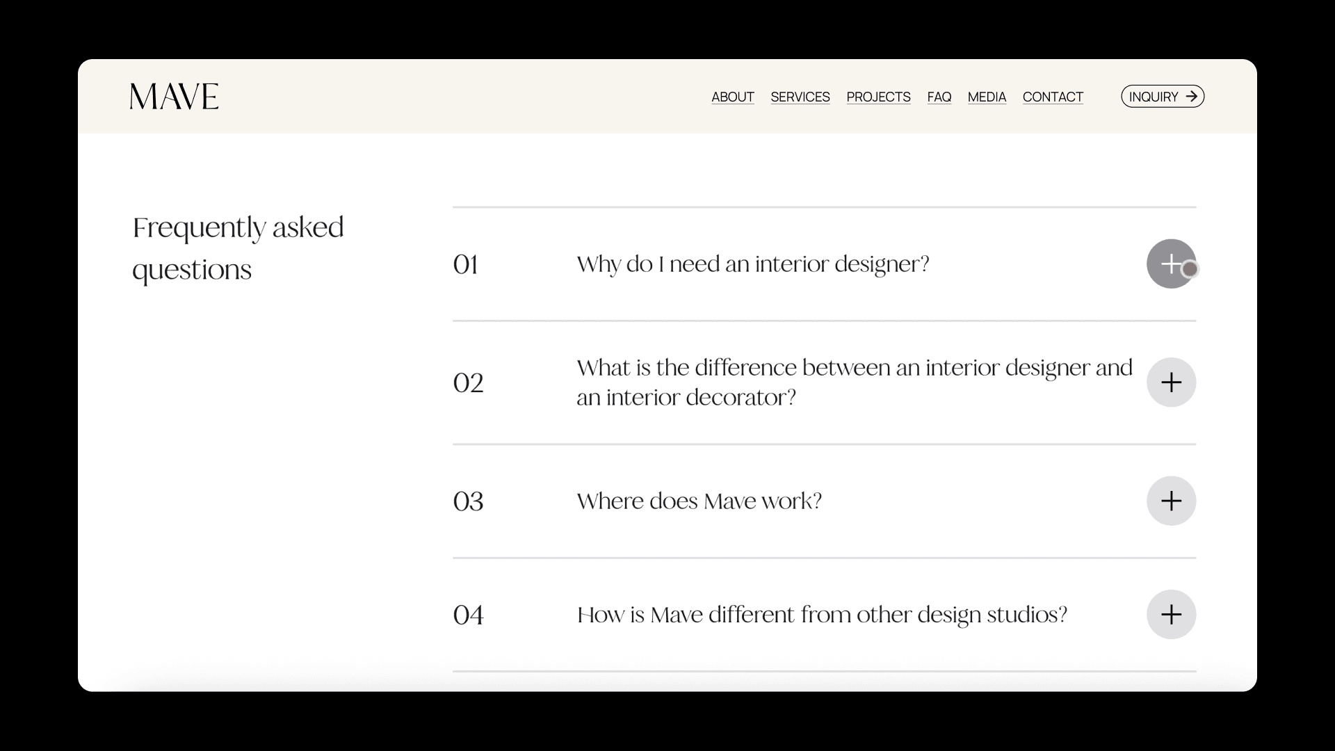
I kept the UX very simple on purpose. Quiet interactions, a clear flow, nothing that pulls attention away from Mave's actual work. The interface should feel invisible.
The projects section needed to do a lot. Show work at every stage, from early concept to finished space, and integrate 3D renders for projects still being built. I designed it to feel like a portfolio within a portfolio: visual, detailed, and easy to move through without feeling overwhelming.
The Logo
UI / UX Design
Stripped back to the essentials. Clean, legible, modern. Works at any size and sits comfortably next to strong imagery without competing with it.
I kept the UX very simple on purpose. Quiet interactions, a clear flow, nothing that pulls attention away from Mave's actual work. The interface should feel invisible.
I kept the UX very simple on purpose. Quiet interactions, a clear flow, nothing that pulls attention away from Mave's actual work. The interface should feel invisible.
UI / UX Design
Stripped back to the essentials. Clean, legible, modern. Works at any size and sits comfortably next to strong imagery without competing with it.
The Logo
The Logo
Stripped back to the essentials. Clean, legible, modern. Works at any size and sits comfortably next to strong imagery without competing with it.
The projects section needed to do a lot. Show work at every stage, from early concept to finished space, and integrate 3D renders for projects still being built. I designed it to feel like a portfolio within a portfolio: visual, detailed, and easy to move through without feeling overwhelming.
Projects
The Logo
Stripped back to the essentials. Clean, legible, modern. Works at any size and sits comfortably next to strong imagery without competing with it.