

Lucid
Lucid

Lucid is a horror feature by Sublunar Films, a production company known for making things that look and feel genuinely cinematic. I joined the project during production to create the film's graphic identity: poster, merch, and website. It went on to screen at Sitges, Brooklyn Horror, and Fantasia in Montreal, which was very cool to watch happen.
Lucid is a horror feature by Sublunar Films, a production company known for making things that look and feel genuinely cinematic. I joined the project during production to create the film's graphic identity: poster, merch, and website. It went on to screen at Sitges, Brooklyn Horror, and Fantasia in Montreal, which was very cool to watch happen.


Client
Sublunar Films
Deliverables
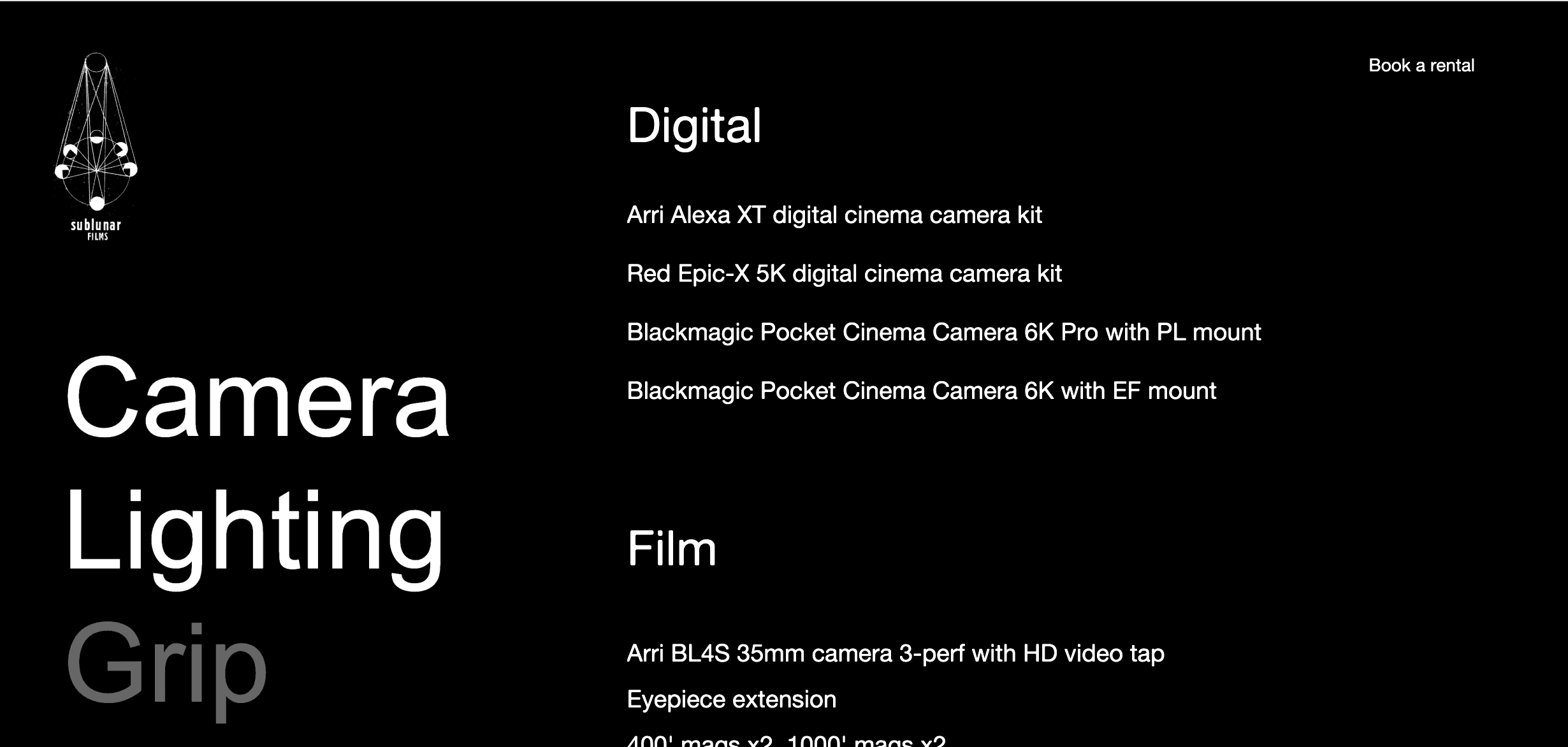
Website Poster Design T-shirt Design Film Design assets Rentals Platform
Year
2024
Role
Creative Direction
Client
Sublunar Films
Deliverables
Website Poster Design T-shirt Design Film Design assets Rentals Platform
Year
2024
Role
Creative Direction

The Site
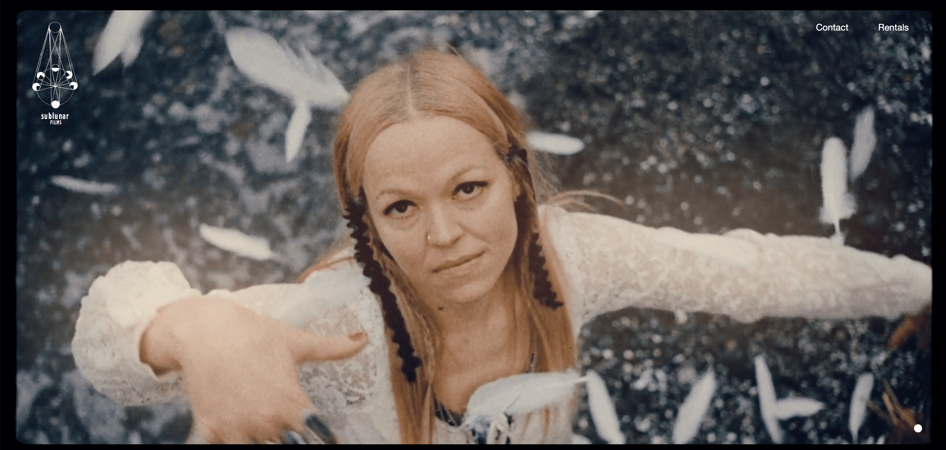
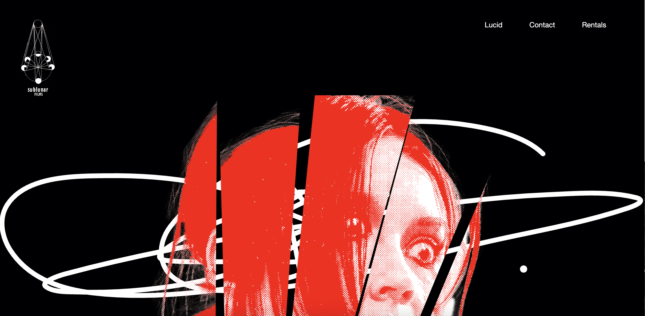
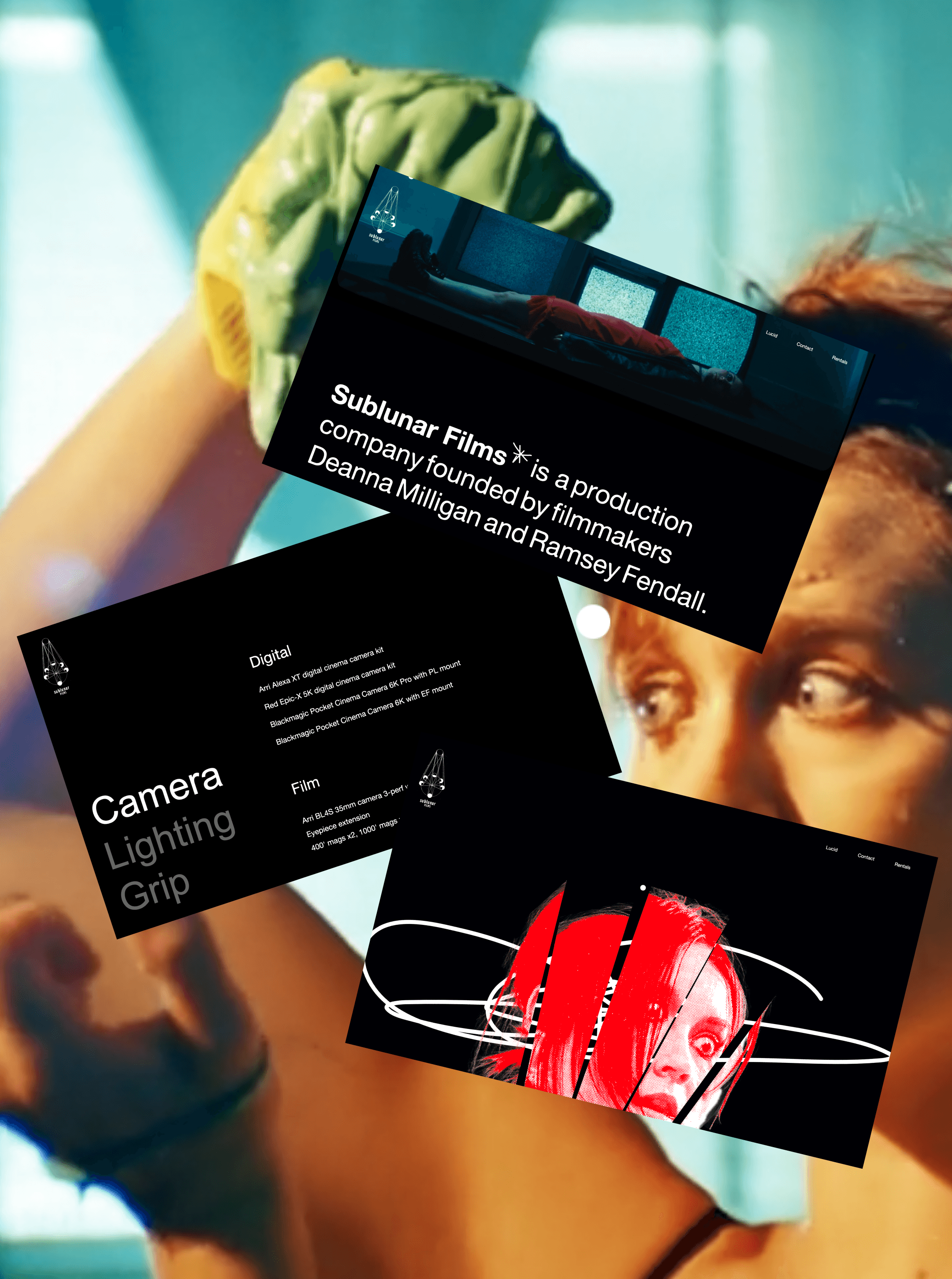
Built to match the film's tone: dark, immersive, and a bit ominous. The visuals do the heavy lifting and the layouts get out of the way.
Built to match the film's tone: dark, immersive, and a bit ominous. The visuals do the heavy lifting and the layouts get out of the way.
The T-Shirt design
The Site
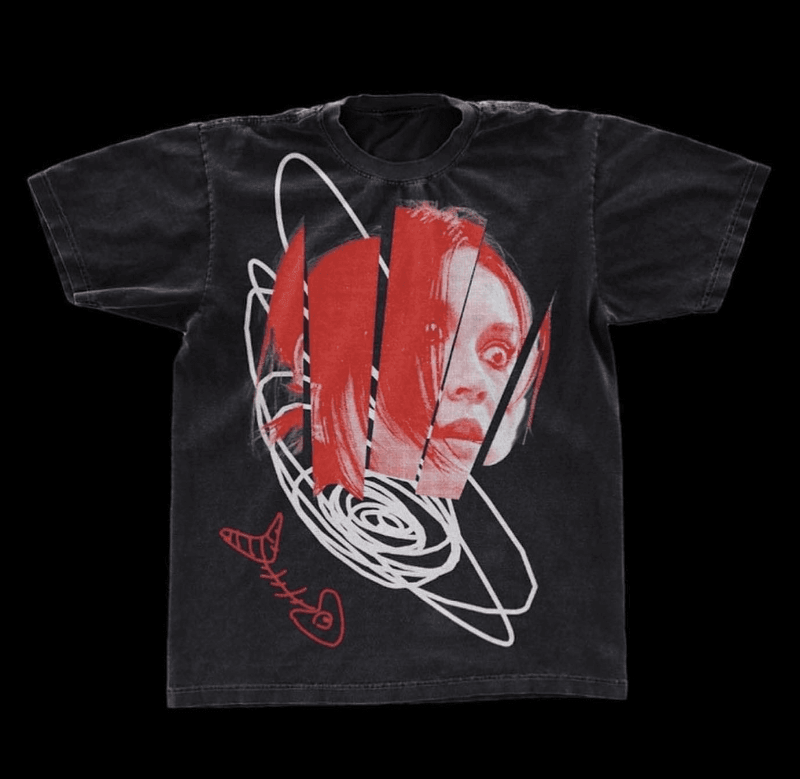
The merch had to carry the film's mood off-screen. Bold, dark, intense enough that someone would actually want to wear it to a midnight screening. It had to feel like it belonged to the world of Lucid, not just nod to it.
Built to match the film's tone: dark, immersive, and a bit ominous. The visuals do the heavy lifting and the layouts get out of the way.
Cinematography
The T-Shirt design
The film's cinematography gave me a lot to draw from. I used the lighting, textures, and visual tone the directors had already built as direct references across every asset. That consistency mattered a lot.
The merch had to carry the film's mood off-screen. Bold, dark, intense enough that someone would actually want to wear it to a midnight screening. It had to feel like it belonged to the world of Lucid, not just nod to it.
Festivals
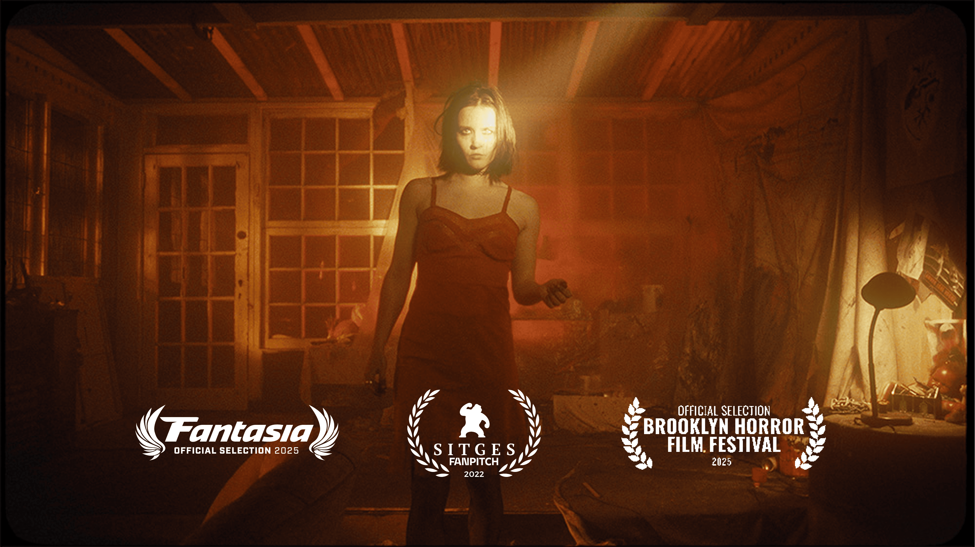
Watching the designs travel with the film through the festival circuit was genuinely one of the highlights of this project. From Sitges to Brooklyn to Montreal, the identity held up everywhere and helped tell the story of Lucid before most people had seen a frame of it.
Festivals
Watching the designs travel with the film through the festival circuit was genuinely one of the highlights of this project. From Sitges to Brooklyn to Montreal, the identity held up everywhere and helped tell the story of Lucid before most people had seen a frame of it.
Visuals
Cinematography
The visual direction leaned hard into a punky 90s horror sensibility. Gritty, bold, atmospheric, a little unsettling. The goal was to make someone feel something before they read a word.
The film's cinematography gave me a lot to draw from. I used the lighting, textures, and visual tone the directors had already built as direct references across every asset. That consistency mattered a lot.
The film's cinematography gave me a lot to draw from. I used the lighting, textures, and visual tone the directors had already built as direct references across every asset. That consistency mattered a lot.
Cinematography
The visual direction leaned hard into a punky 90s horror sensibility. Gritty, bold, atmospheric, a little unsettling. The goal was to make someone feel something before they read a word.
Visuals
Watching the designs travel with the film through the festival circuit was genuinely one of the highlights of this project. From Sitges to Brooklyn to Montreal, the identity held up everywhere and helped tell the story of Lucid before most people had seen a frame of it.
Festivals
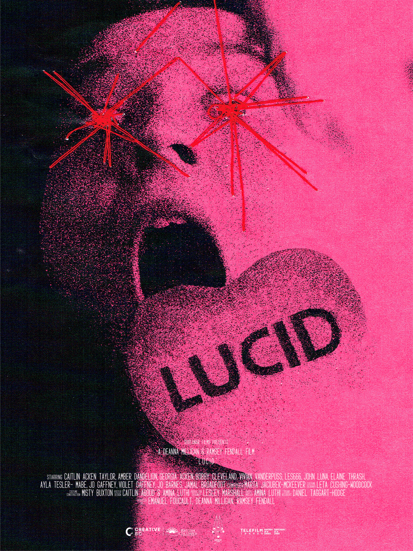
I wanted the poster to feel made in the same way the film was made. I used physical materials, needle and thread, scanned them, and worked them into the final design. It gave the poster a raw, handmade quality that felt honest to how the whole production came together.
The Poster
The Poster
Visuals
I wanted the poster to feel made in the same way the film was made. I used physical materials, needle and thread, scanned them, and worked them into the final design. It gave the poster a raw, handmade quality that felt honest to how the whole production came together.
The visual direction leaned hard into a punky 90s horror sensibility. Gritty, bold, atmospheric, a little unsettling. The goal was to make someone feel something before they read a word.
Festivals
Watching the designs travel with the film through the festival circuit was genuinely one of the highlights of this project. From Sitges to Brooklyn to Montreal, the identity held up everywhere and helped tell the story of Lucid before most people had seen a frame of it.
The Poster
I wanted the poster to feel made in the same way the film was made. I used physical materials, needle and thread, scanned them, and worked them into the final design. It gave the poster a raw, handmade quality that felt honest to how the whole production came together.
The merch had to carry the film's mood off-screen. Bold, dark, intense enough that someone would actually want to wear it to a midnight screening. It had to feel like it belonged to the world of Lucid, not just nod to it.
The T-Shirt design
The Poster
I wanted the poster to feel made in the same way the film was made. I used physical materials, needle and thread, scanned them, and worked them into the final design. It gave the poster a raw, handmade quality that felt honest to how the whole production came together.
Visuals
The visual direction leaned hard into a punky 90s horror sensibility. Gritty, bold, atmospheric, a little unsettling. The goal was to make someone feel something before they read a word.
The Poster
I wanted the poster to feel made in the same way the film was made. I used physical materials, needle and thread, scanned them, and worked them into the final design. It gave the poster a raw, handmade quality that felt honest to how the whole production came together.