

Routines by Ediket
Routines by Ediket

Ediket was changing hands. The new owners wanted the whole thing rebuilt, starting with the name: Ediket became Routines by Ediket, and everything downstream of that had to change with it. I did all of it. The identity, the design system, and the storefront.
Ediket was changing hands. The new owners wanted the whole thing rebuilt, starting with the name: Ediket became Routines by Ediket, and everything downstream of that had to change with it. I did all of it. The identity, the design system, and the storefront.


Client
Ediket
Deliverables
Brand identity and lockups Brand guide Design system and components E-commerce web design Email templates
Year
2026
Role
Designer
Client
Ediket
Deliverables
Brand identity and lockups Brand guide Design system and components E-commerce web design Email templates
Year
2026
Role
Designer

The Brief
Reflection
The business was changing hands, and the new owners wanted a clean break from what was there before. Same products, new name, new everything else to go with it. Ediket became Routines by Ediket, which sounds like a small change until you say it out loud. It moves the brand from a label on a bottle to something you actually do every day.
The business was changing hands, and the new owners wanted a clean break from what was there before. Same products, new name, new everything else to go with it. Ediket became Routines by Ediket, which sounds like a small change until you say it out loud. It moves the brand from a label on a bottle to something you actually do every day.
Doing the identity and the site at the same time turned out to be the easy version of this job. Nothing had to be reverse engineered out of someone else's logo, so every decision on a product tile could point straight back at a decision in the wordmark.

The Identity
The Brief
The name had to work at a lot of sizes, so I built it as a system rather than one logo. A wordmark, a lockup carrying the Ediket endorsement, and a mark that can stand on its own, all drawn on the same construction grid. Then I set out where each one is allowed to sit: on gray, on white, on near black, on the blue wash and on the yellow. Six approved applications, so nobody downstream has to guess.
The business was changing hands, and the new owners wanted a clean break from what was there before. Same products, new name, new everything else to go with it. Ediket became Routines by Ediket, which sounds like a small change until you say it out loud. It moves the brand from a label on a bottle to something you actually do every day.
The System
The Identity
Three colour groups, each with a job. The grays are the workhorse, carrying buttons, text, links and anything functional, keeping the interface legible and out of the way. The blue is a quiet presence that adds depth without pulling focus, used as a wash rather than a statement. The yellow is accent only, a single word or a small tag, and the one time it is allowed to carry a background is yellow-strong. Denton is reserved for marketing headlines, CTAs and the wordmark itself. Everything else is KMR Waldenburg, set in all caps when it is labelling a section.
The name had to work at a lot of sizes, so I built it as a system rather than one logo. A wordmark, a lockup carrying the Ediket endorsement, and a mark that can stand on its own, all drawn on the same construction grid. Then I set out where each one is allowed to sit: on gray, on white, on near black, on the blue wash and on the yellow. Six approved applications, so nobody downstream has to guess.


The Storefront
The System
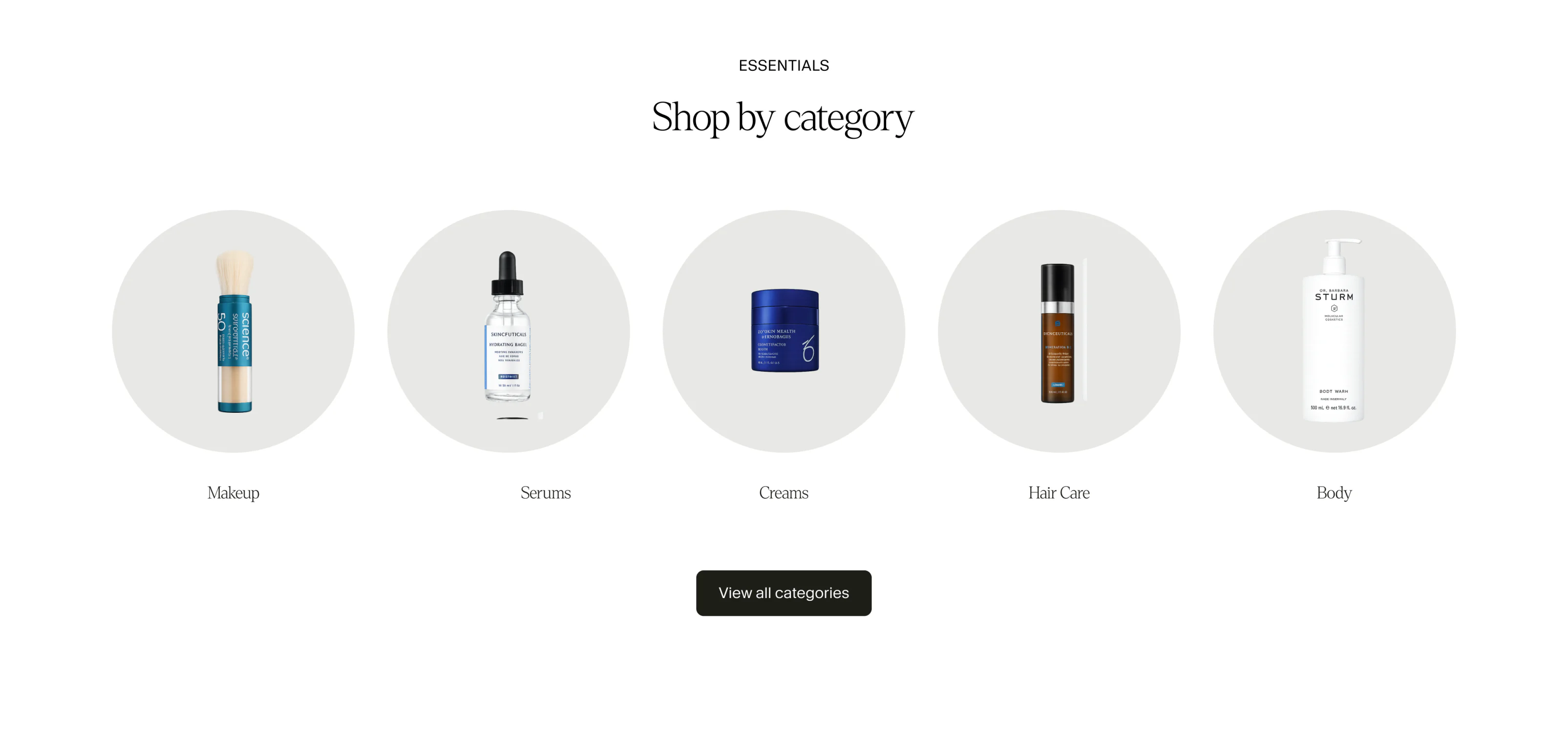
The homepage leads with photography rather than packaging, close enough that you read it as skin before you read it as an advert. The products sit on pale tiles underneath, so the grid stays quiet and the pictures carry it.
Three colour groups, each with a job. The grays are the workhorse, carrying buttons, text, links and anything functional, keeping the interface legible and out of the way. The blue is a quiet presence that adds depth without pulling focus, used as a wash rather than a statement. The yellow is accent only, a single word or a small tag, and the one time it is allowed to carry a background is yellow-strong. Denton is reserved for marketing headlines, CTAs and the wordmark itself. Everything else is KMR Waldenburg, set in all caps when it is labelling a section.


Three colour groups, each with a job. The grays are the workhorse, carrying buttons, text, links and anything functional, keeping the interface legible and out of the way. The blue is a quiet presence that adds depth without pulling focus, used as a wash rather than a statement. The yellow is accent only, a single word or a small tag, and the one time it is allowed to carry a background is yellow-strong. Denton is reserved for marketing headlines, CTAs and the wordmark itself. Everything else is KMR Waldenburg, set in all caps when it is labelling a section.
The System
The homepage leads with photography rather than packaging, close enough that you read it as skin before you read it as an advert. The products sit on pale tiles underneath, so the grid stays quiet and the pictures carry it.
The Storefront
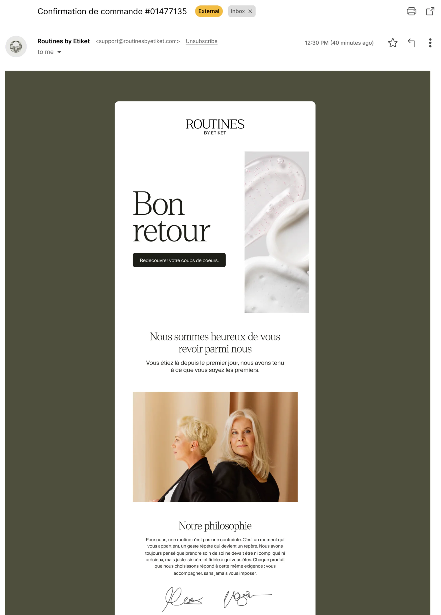
The same system had to survive a second channel. Four templates, a welcome, a return and two campaign layouts, written in French for the brand's own market and built from the same lockup, the same Denton headline and the same product photography. Email is usually where a brand quietly abandons its own rules. These were drawn straight off the guide, so nothing had to be reinvented inside a mail client.
Doing the identity and the site at the same time turned out to be the easy version of this job. Nothing had to be reverse engineered out of someone else's logo, so every decision on a product tile could point straight back at a decision in the wordmark.
Reflection
The Storefront
The homepage leads with photography rather than packaging, close enough that you read it as skin before you read it as an advert. The products sit on pale tiles underneath, so the grid stays quiet and the pictures carry it.
The same system had to survive a second channel. Four templates, a welcome, a return and two campaign layouts, written in French for the brand's own market and built from the same lockup, the same Denton headline and the same product photography. Email is usually where a brand quietly abandons its own rules. These were drawn straight off the guide, so nothing had to be reinvented inside a mail client.
Reflection
Doing the identity and the site at the same time turned out to be the easy version of this job. Nothing had to be reverse engineered out of someone else's logo, so every decision on a product tile could point straight back at a decision in the wordmark.
The name had to work at a lot of sizes, so I built it as a system rather than one logo. A wordmark, a lockup carrying the Ediket endorsement, and a mark that can stand on its own, all drawn on the same construction grid. Then I set out where each one is allowed to sit: on gray, on white, on near black, on the blue wash and on the yellow. Six approved applications, so nobody downstream has to guess.
The Identity
The same system had to survive a second channel. Four templates, a welcome, a return and two campaign layouts, written in French for the brand's own market and built from the same lockup, the same Denton headline and the same product photography. Email is usually where a brand quietly abandons its own rules. These were drawn straight off the guide, so nothing had to be reinvented inside a mail client.
Reflection
Doing the identity and the site at the same time turned out to be the easy version of this job. Nothing had to be reverse engineered out of someone else's logo, so every decision on a product tile could point straight back at a decision in the wordmark.
The Storefront
The homepage leads with photography rather than packaging, close enough that you read it as skin before you read it as an advert. The products sit on pale tiles underneath, so the grid stays quiet and the pictures carry it.