

Ossa
Ossa

Ossa is a residential development in Squamish, BC, built around the idea that where you live should connect you to something bigger than four walls. Named after a nearby mountain, the project needed a full branding suite: identity, floor plans, site maps, and a publication brochure. It was a proper end-to-end project and one I'm genuinely proud of.
Ossa is a residential development in Squamish, BC, built around the idea that where you live should connect you to something bigger than four walls. Named after a nearby mountain, the project needed a full branding suite: identity, floor plans, site maps, and a publication brochure. It was a proper end-to-end project and one I'm genuinely proud of.


Client
Ossa at Finch Drive
Deliverables
Branding Floorplans Site Plans Site Maps Publication Brochure
Year
2025
Role
Branding, Drafting, Project Lead
Client
Ossa at Finch Drive
Deliverables
Branding Floorplans Site Plans Site Maps Publication Brochure
Year
2025
Role
Branding, Drafting, Project Lead
Behind The Icon
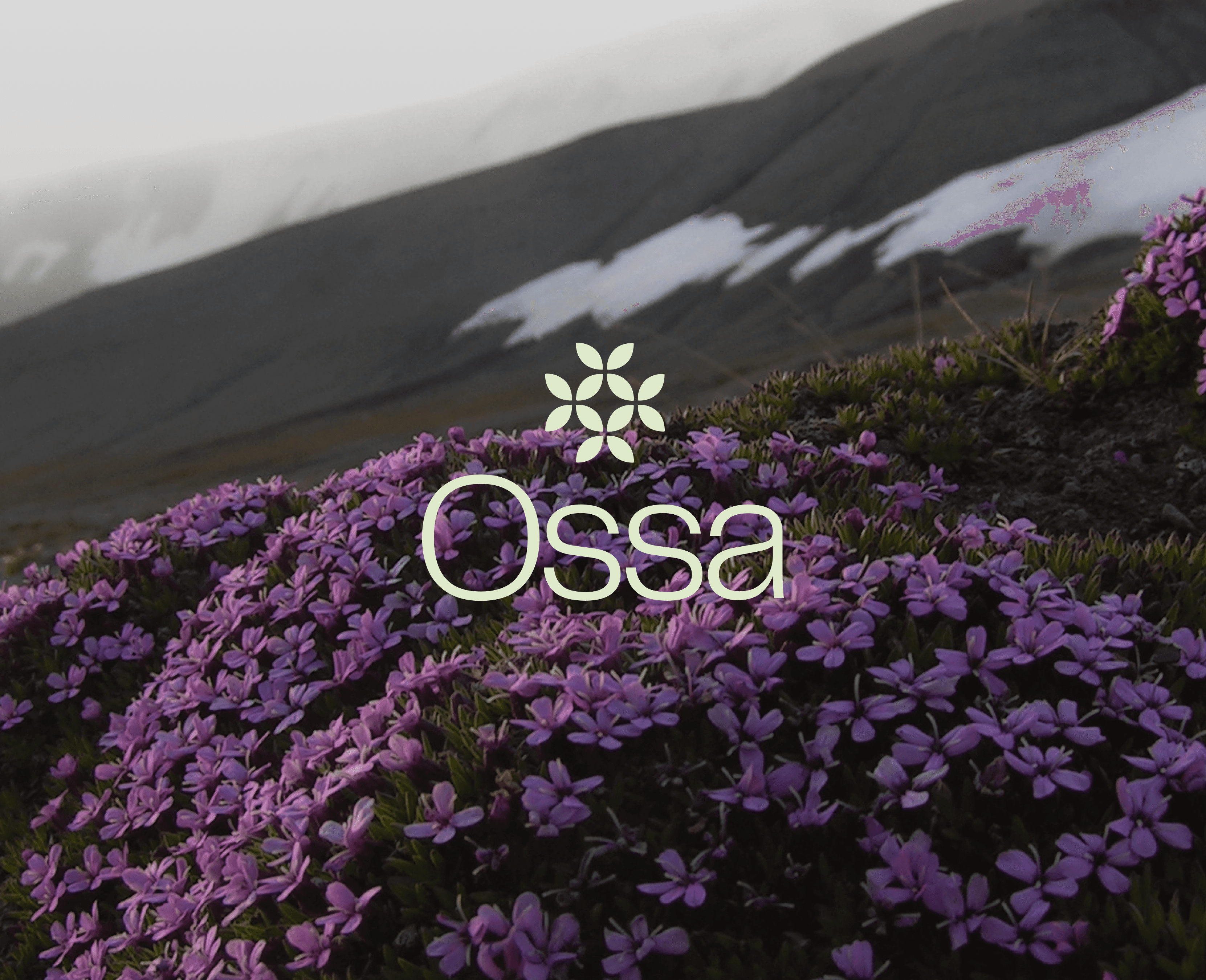
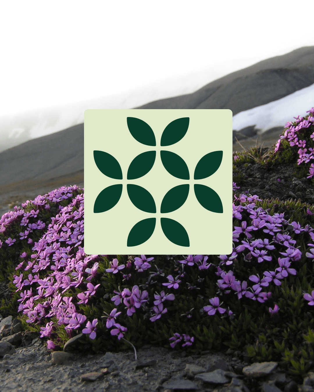
The mark came from the Moss campion flower, a plant that grows in rocky alpine conditions and creates tiny ecosystems around itself. It felt like exactly the right reference for a development trying to build real community in a place people usually just drive through.
The mark came from the Moss campion flower, a plant that grows in rocky alpine conditions and creates tiny ecosystems around itself. It felt like exactly the right reference for a development trying to build real community in a place people usually just drive through.
Behind The Icon
The mark came from the Moss campion flower, a plant that grows in rocky alpine conditions and creates tiny ecosystems around itself. It felt like exactly the right reference for a development trying to build real community in a place people usually just drive through.
Minimalist Design
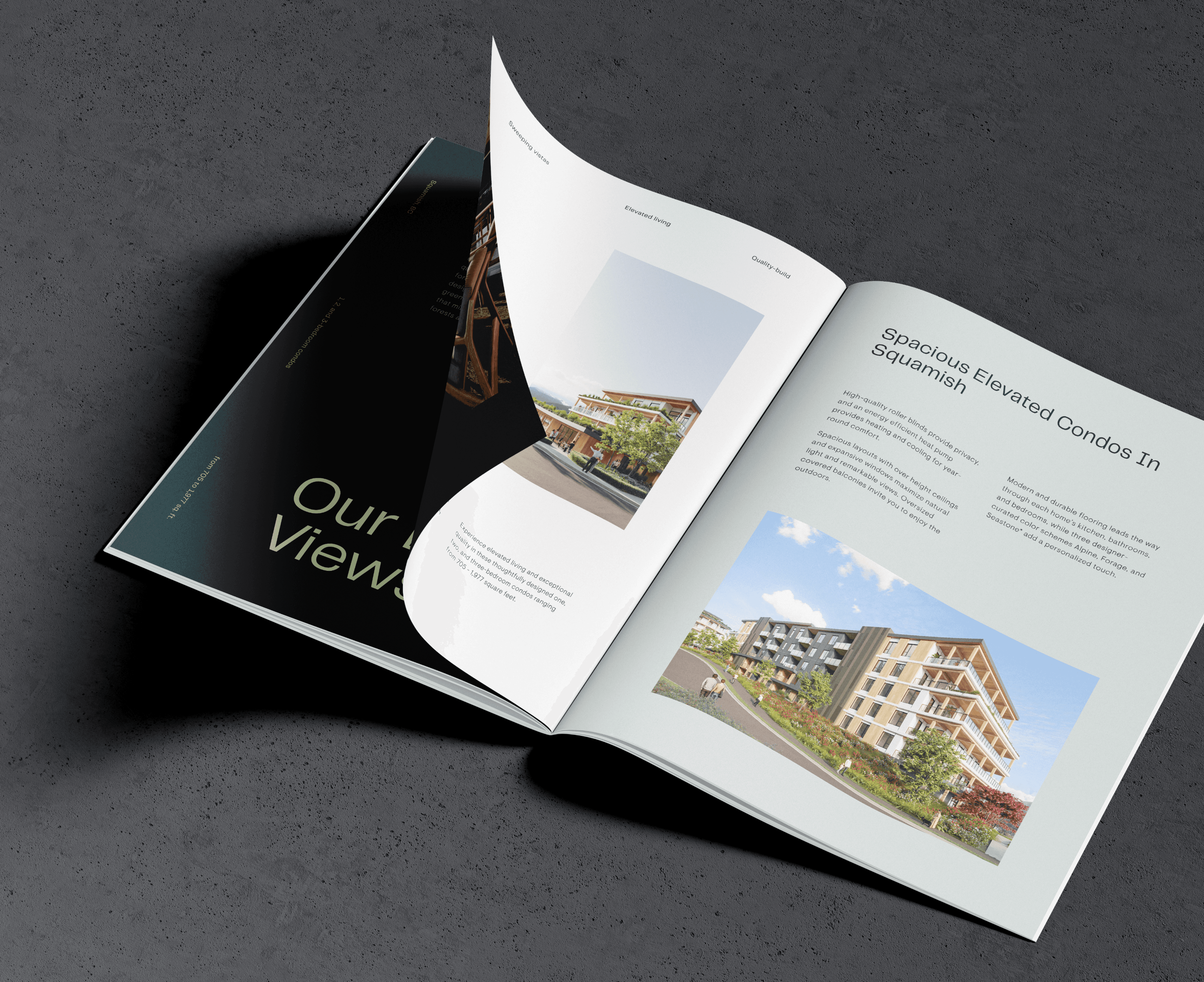
The publication balances bold visuals with clean, restrained layouts. It needed to feel premium and environmentally conscious at the same time, which sounds easy but isn't. I think it landed.
The map
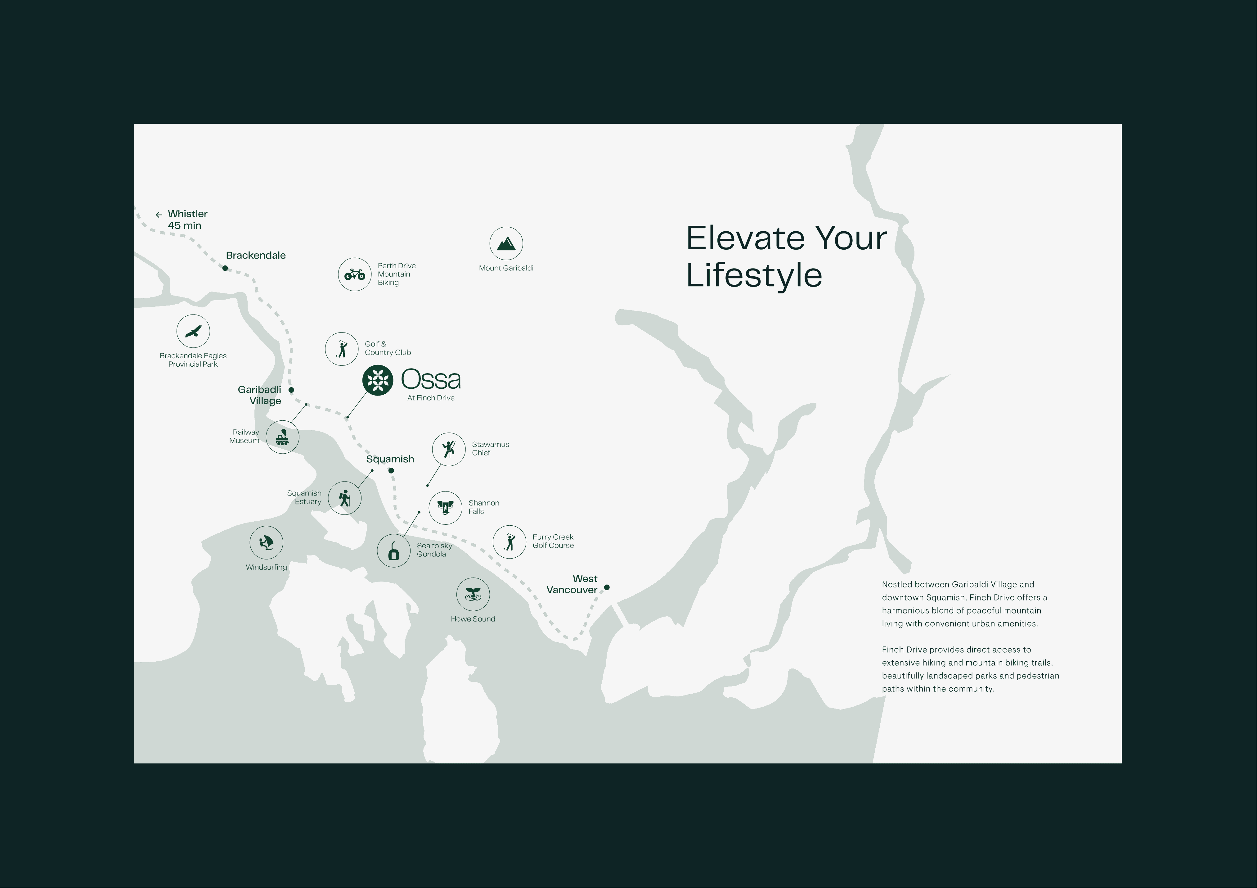
Honestly, mapping the neighborhood was one of the more enjoyable parts of this project. I spent time exploring the area around the site and tried to capture its actual character in something visual, warm and useful, not just a technical asset.
The map
Honestly, mapping the neighborhood was one of the more enjoyable parts of this project. I spent time exploring the area around the site and tried to capture its actual character in something visual, warm and useful, not just a technical asset.
Floor Plans
Minimalist Design
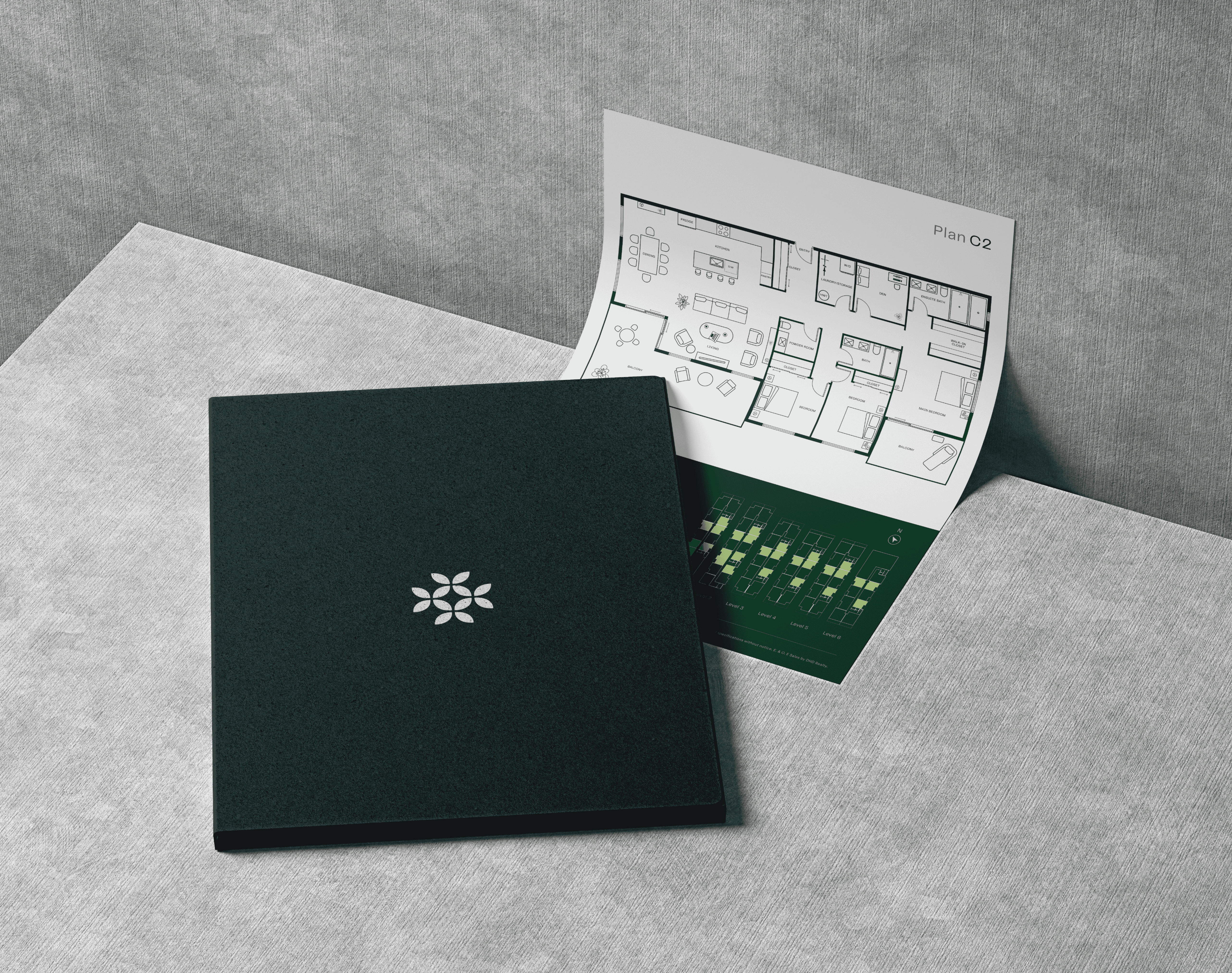
50 units across six levels, including a penthouse. I took the technical drawings and redesigned them to be genuinely easy to read. Clear enough that a buyer can understand their future home without needing to decode an architectural plan.
The publication balances bold visuals with clean, restrained layouts. It needed to feel premium and environmentally conscious at the same time, which sounds easy but isn't. I think it landed.
The publication balances bold visuals with clean, restrained layouts. It needed to feel premium and environmentally conscious at the same time, which sounds easy but isn't. I think it landed.
Minimalist Design
50 units across six levels, including a penthouse. I took the technical drawings and redesigned them to be genuinely easy to read. Clear enough that a buyer can understand their future home without needing to decode an architectural plan.
Floor Plans
Honestly, mapping the neighborhood was one of the more enjoyable parts of this project. I spent time exploring the area around the site and tried to capture its actual character in something visual, warm and useful, not just a technical asset.
The map
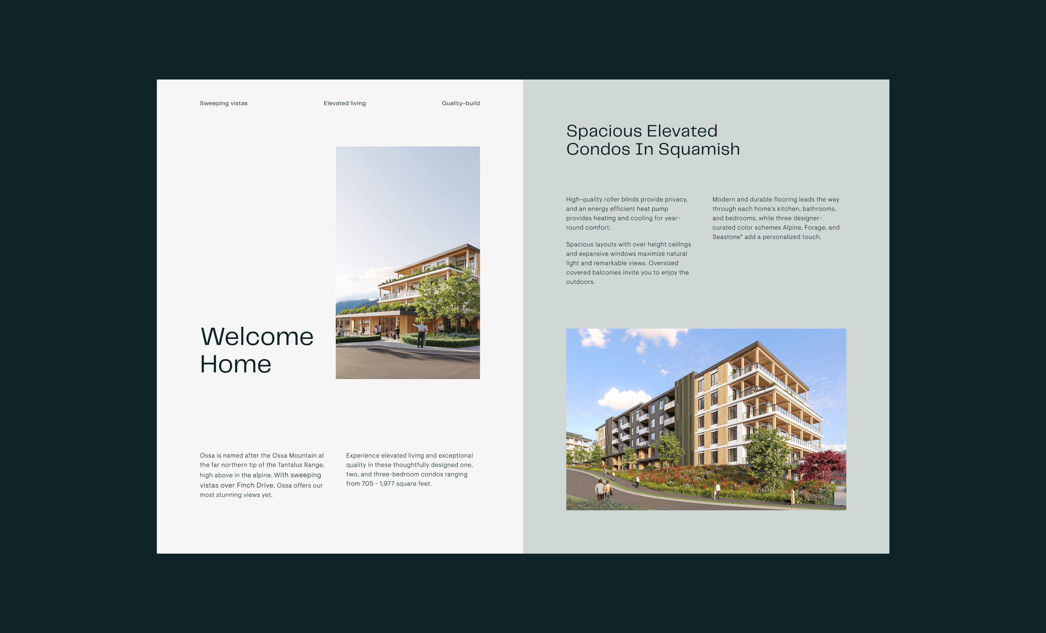
The final brochure brings the whole identity together in print, making the case for Ossa as somewhere worth choosing.
Publication
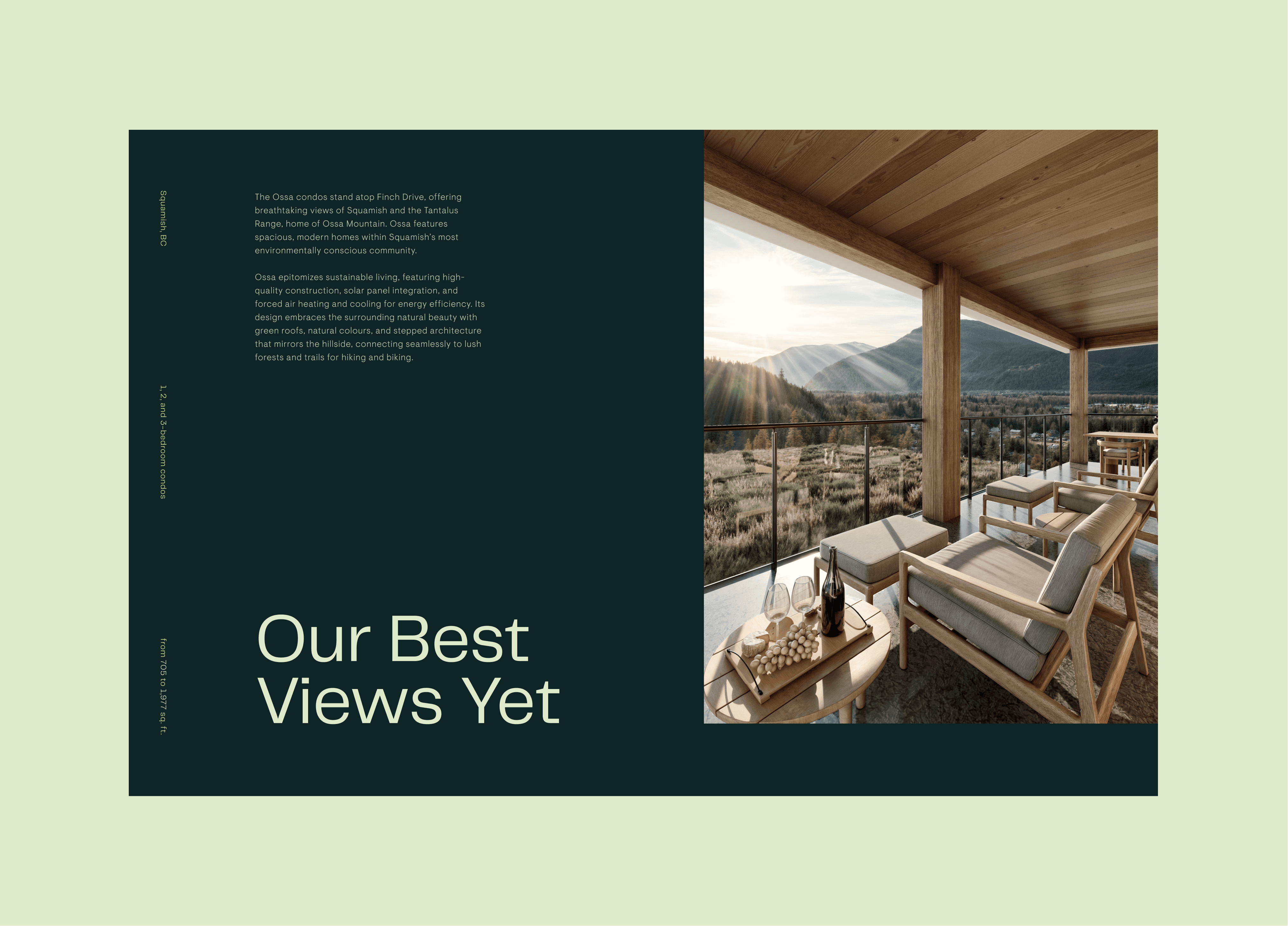
I built the visual system around natural strength and architectural calm. Grounded typography, earthy colors that don't tip into rustic, and layouts with enough breathing room to feel considered rather than cramped.
The approach
Publication
Floor Plans
The final brochure brings the whole identity together in print, making the case for Ossa as somewhere worth choosing.
50 units across six levels, including a penthouse. I took the technical drawings and redesigned them to be genuinely easy to read. Clear enough that a buyer can understand their future home without needing to decode an architectural plan.
The approach
The map
I built the visual system around natural strength and architectural calm. Grounded typography, earthy colors that don't tip into rustic, and layouts with enough breathing room to feel considered rather than cramped.
Honestly, mapping the neighborhood was one of the more enjoyable parts of this project. I spent time exploring the area around the site and tried to capture its actual character in something visual, warm and useful, not just a technical asset.
Publication
The final brochure brings the whole identity together in print, making the case for Ossa as somewhere worth choosing.
Publication
The final brochure brings the whole identity together in print, making the case for Ossa as somewhere worth choosing.
The approach
I built the visual system around natural strength and architectural calm. Grounded typography, earthy colors that don't tip into rustic, and layouts with enough breathing room to feel considered rather than cramped.
Floor Plans
50 units across six levels, including a penthouse. I took the technical drawings and redesigned them to be genuinely easy to read. Clear enough that a buyer can understand their future home without needing to decode an architectural plan.
Publication
The final brochure brings the whole identity together in print, making the case for Ossa as somewhere worth choosing.