


CalmWave
CalmWave
CalmWave is an AI-powered healthcare platform that brings together alarms, vitals, and EHR data in real time. By analyzing this information, it delivers actionable insights that help clinical teams make faster, smarter decisions, reduce noise, and improve patient safety.
CalmWave is an AI-powered healthcare platform that brings together alarms, vitals, and EHR data in real time. By analyzing this information, it delivers actionable insights that help clinical teams make faster, smarter decisions, reduce noise, and improve patient safety.
Client
CalmWave
Deliverables
Website - Desktop and Mobile Logo Refresh Brand Guide
Year
2025
Role
Brand and Product Designer
the Goal
Illustrations
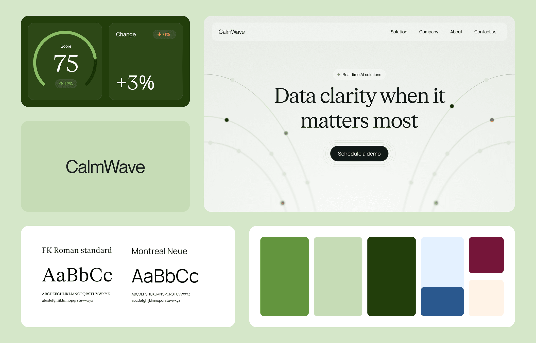
CalmWave started with a simple mission, make complex clinical data easier to understand and act on. As the platform grows beyond hospitals into new industries, the challenge was to create a brand and website that feel clear, approachable, and flexible enough to scale.
We developed a series of abstract, stylish illustrations that visualize CalmWave’s core concepts , blending data, clarity, and human intuition, through layered shapes, flowing motion, and a refined sense of balance.
The Outcome
The refreshed branding and website bring it all together, creating a cohesive, scalable identity.
The flow
the Goal
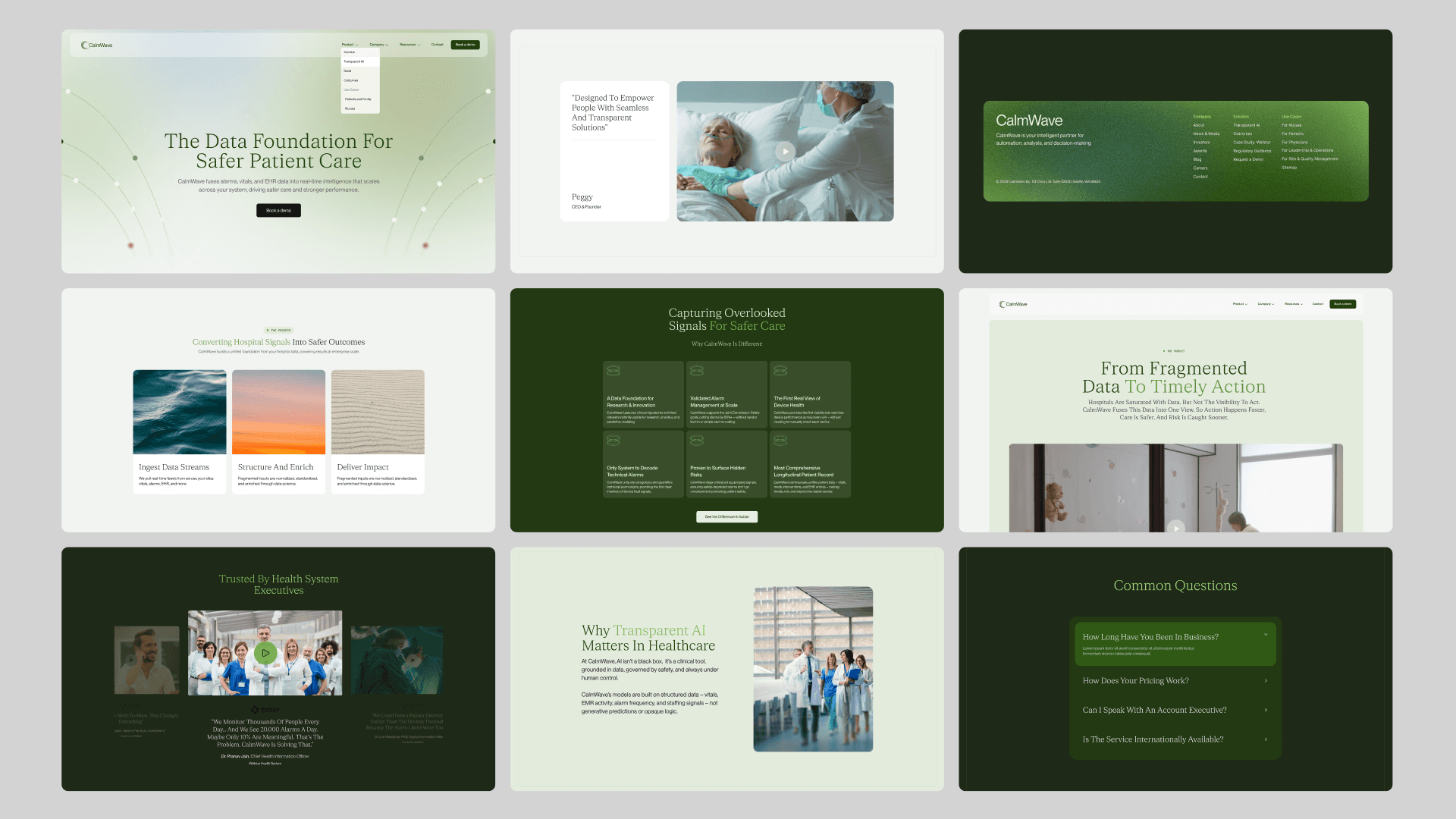
The design focused on clarity and flow. Clean layouts, thoughtful typography, and a structured grid make information easier to digest, while icons and patterns show how data connects in real time.
CalmWave started with a simple mission, make complex clinical data easier to understand and act on. As the platform grows beyond hospitals into new industries, the challenge was to create a brand and website that feel clear, approachable, and flexible enough to scale.

Refinement
The flow
This was not a complete reinvention, but a strategic refinement, strengthening credibility while maintaining brand recognition.
The design focused on clarity and flow. Clean layouts, thoughtful typography, and a structured grid make information easier to digest, while icons and patterns show how data connects in real time.
Exploration
We explored multiple visual directions before refining a system built on clean typography, intentional spacing, and a restrained yet expansive colour palette.
Exploration
We explored multiple visual directions before refining a system built on clean typography, intentional spacing, and a restrained yet expansive colour palette.


The palette
Refinement
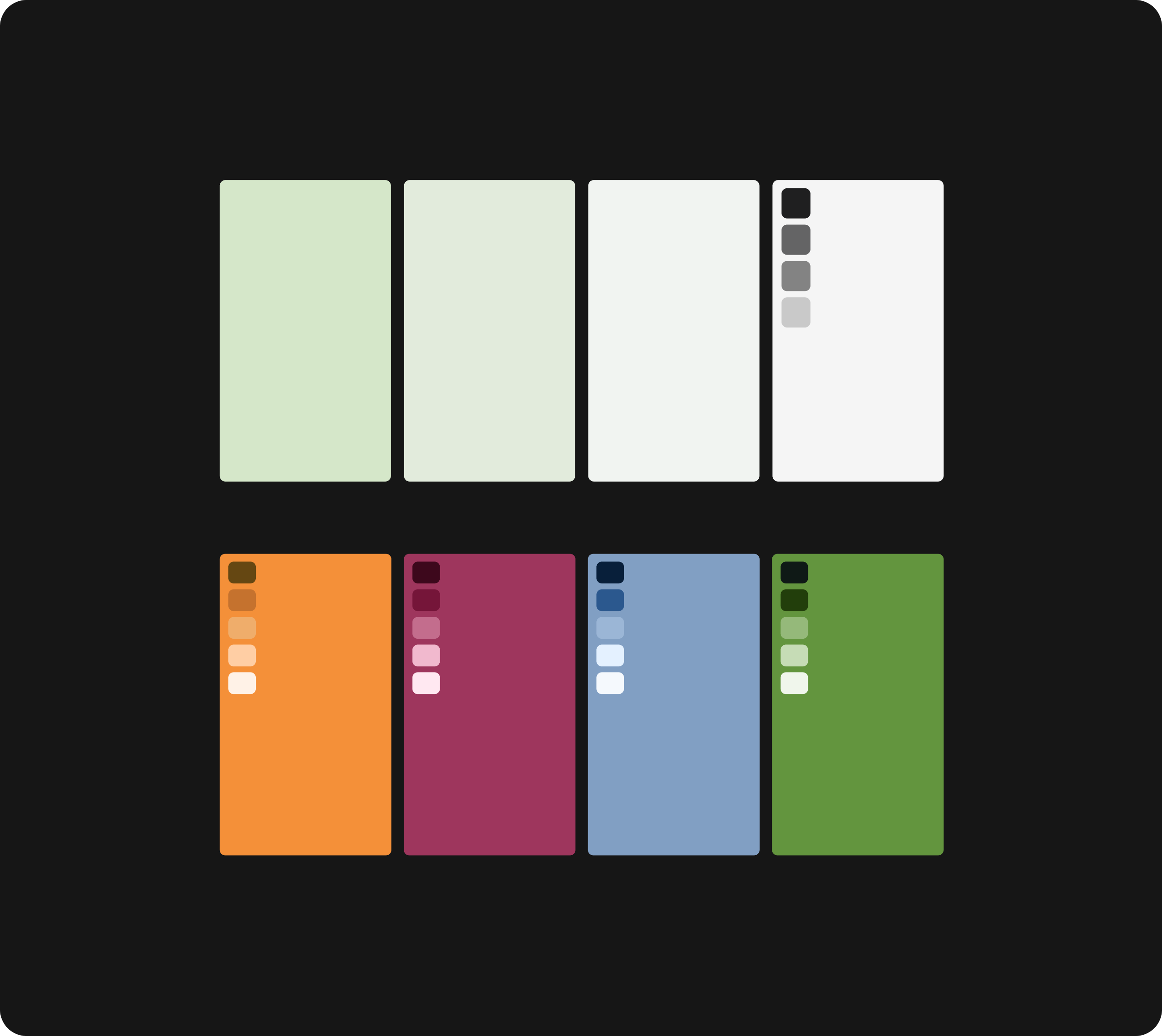
CalmWave’s palette features a series of greens, with just a touch of blue, berry, and tangerine used sparingly. The range of greens does most of the work, creating a calm, grounded feel, while the accent colors add subtle pops of contrast.
This was not a complete reinvention, but a strategic refinement, strengthening credibility while maintaining brand recognition.
This was not a complete reinvention, but a strategic refinement, strengthening credibility while maintaining brand recognition.
Refinement
CalmWave’s palette features a series of greens, with just a touch of blue, berry, and tangerine used sparingly. The range of greens does most of the work, creating a calm, grounded feel, while the accent colors add subtle pops of contrast.
The palette
We explored multiple visual directions before refining a system built on clean typography, intentional spacing, and a restrained yet expansive colour palette.
Exploration
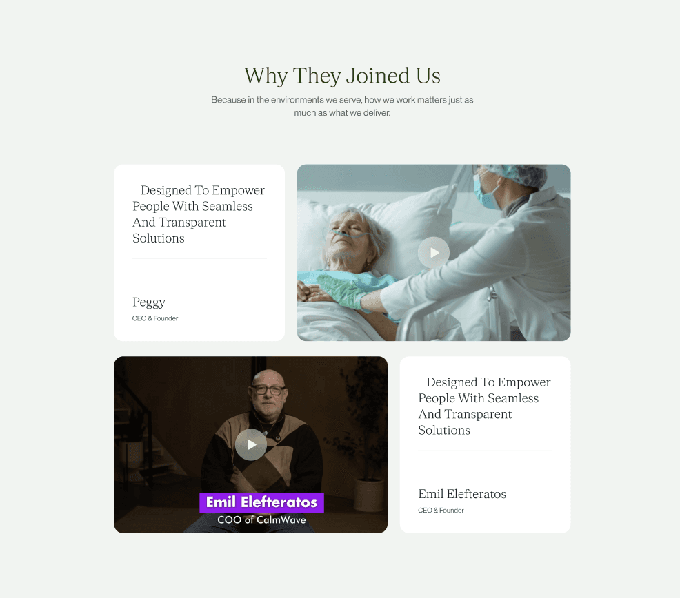
We designed the CalmWave UI/UX to look clean and sophisticated, with a techy edge that’s still approachable and easy to use.
UI / UX Design
We developed a series of abstract, stylish illustrations that visualize CalmWave’s core concepts , blending data, clarity, and human intuition, through layered shapes, flowing motion, and a refined sense of balance.
Illustrations
The refreshed branding and website bring it all together, creating a cohesive, scalable identity.
The Outcome

UI / UX Design
The palette
We designed the CalmWave UI/UX to look clean and sophisticated, with a techy edge that’s still approachable and easy to use.
CalmWave’s palette features a series of greens, with just a touch of blue, berry, and tangerine used sparingly. The range of greens does most of the work, creating a calm, grounded feel, while the accent colors add subtle pops of contrast.


Illustrations
Exploration
We developed a series of abstract, stylish illustrations that visualize CalmWave’s core concepts , blending data, clarity, and human intuition, through layered shapes, flowing motion, and a refined sense of balance.
We explored multiple visual directions before refining a system built on clean typography, intentional spacing, and a restrained yet expansive colour palette.


The Outcome
UI / UX Design
The refreshed branding and website bring it all together, creating a cohesive, scalable identity.
We designed the CalmWave UI/UX to look clean and sophisticated, with a techy edge that’s still approachable and easy to use.


CalmWave started with a simple mission, make complex clinical data easier to understand and act on. As the platform grows beyond hospitals into new industries, the challenge was to create a brand and website that feel clear, approachable, and flexible enough to scale.
the Goal
The design focused on clarity and flow. Clean layouts, thoughtful typography, and a structured grid make information easier to digest, while icons and patterns show how data connects in real time.
The flow


UI / UX Design
We designed the CalmWave UI/UX to look clean and sophisticated, with a techy edge that’s still approachable and easy to use.

Illustrations
We developed a series of abstract, stylish illustrations that visualize CalmWave’s core concepts , blending data, clarity, and human intuition, through layered shapes, flowing motion, and a refined sense of balance.

The Outcome
The refreshed branding and website bring it all together, creating a cohesive, scalable identity.
the Goal
CalmWave started with a simple mission, make complex clinical data easier to understand and act on. As the platform grows beyond hospitals into new industries, the challenge was to create a brand and website that feel clear, approachable, and flexible enough to scale.
The palette
CalmWave’s palette features a series of greens, with just a touch of blue, berry, and tangerine used sparingly. The range of greens does most of the work, creating a calm, grounded feel, while the accent colors add subtle pops of contrast.
